For Vital Signs
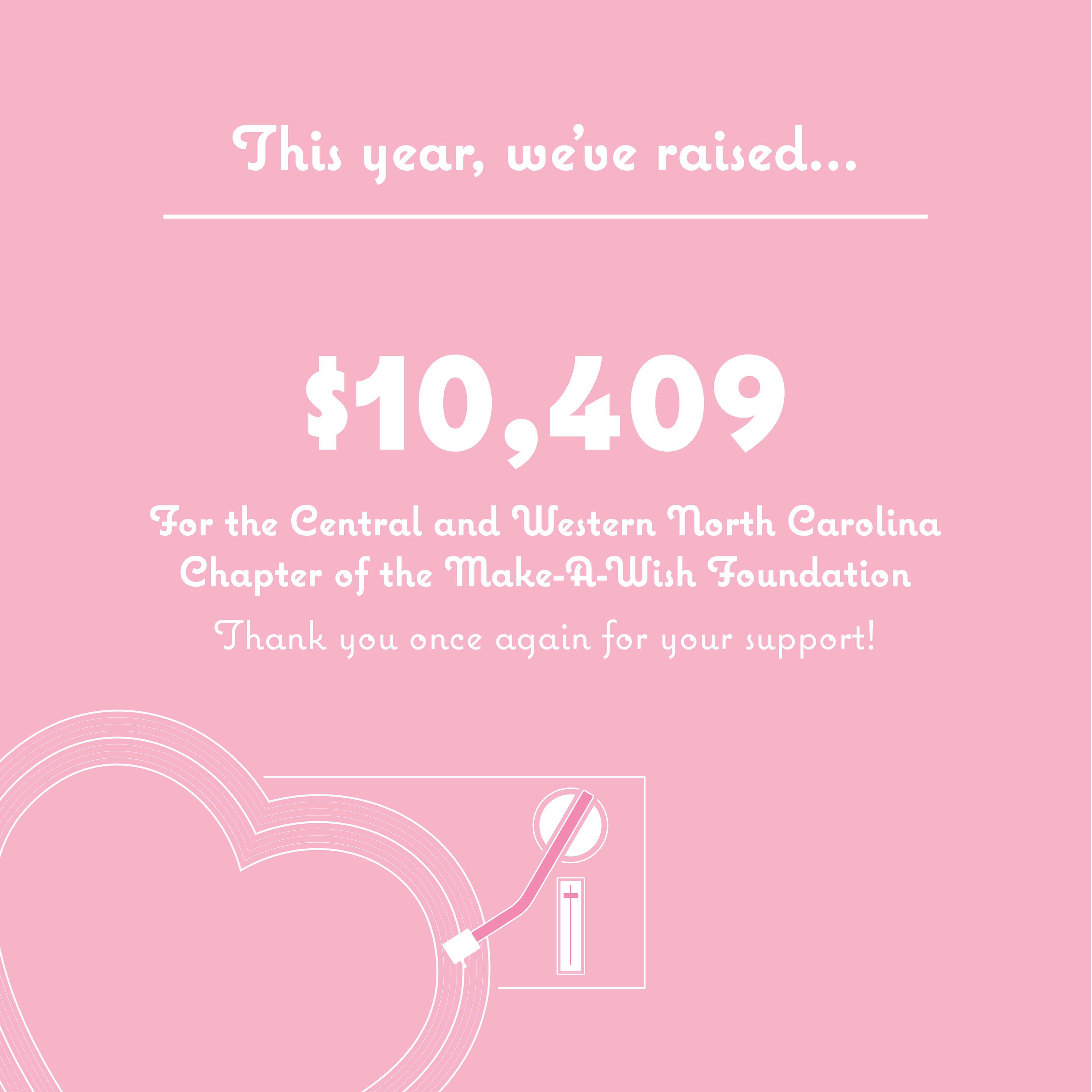


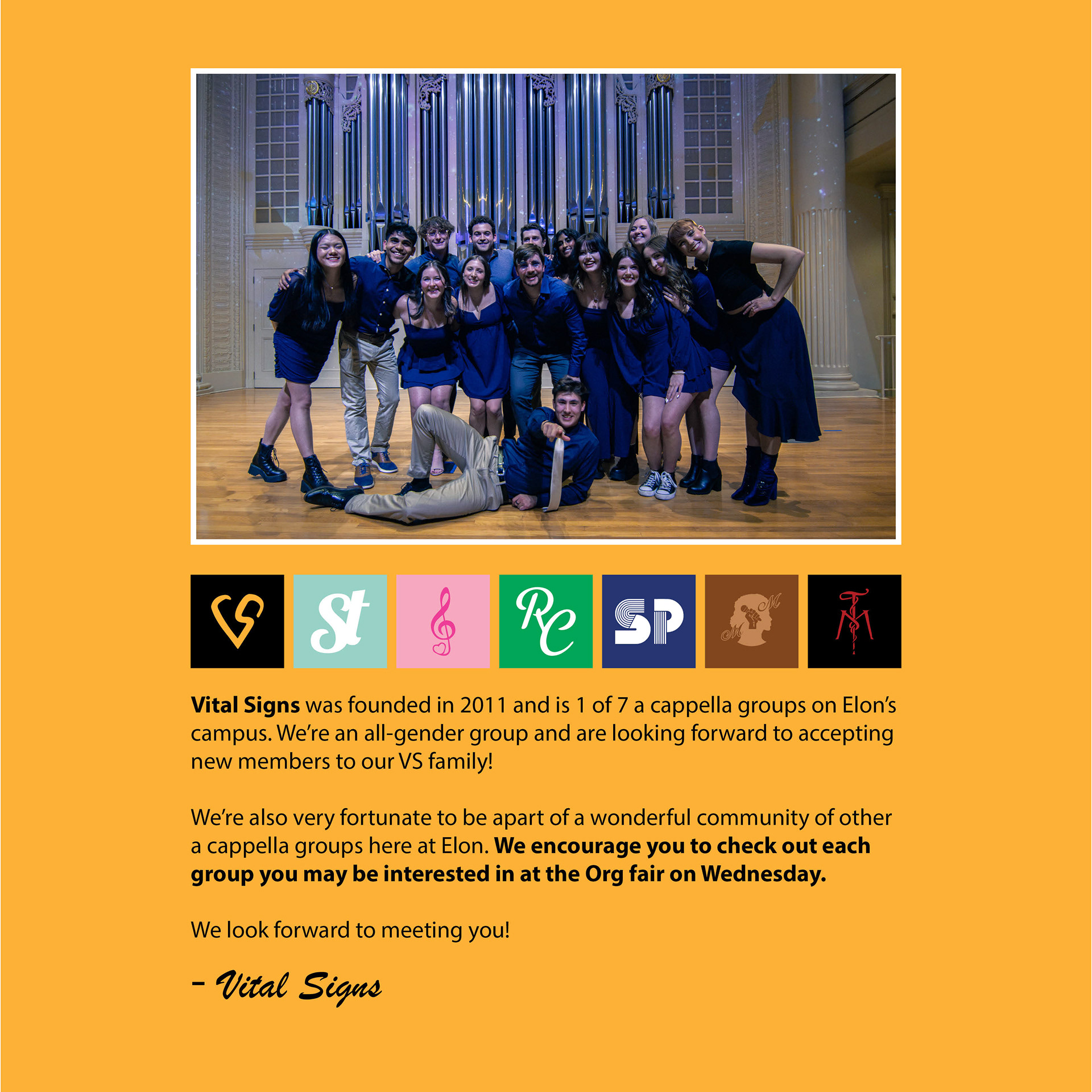

Mock Brochure


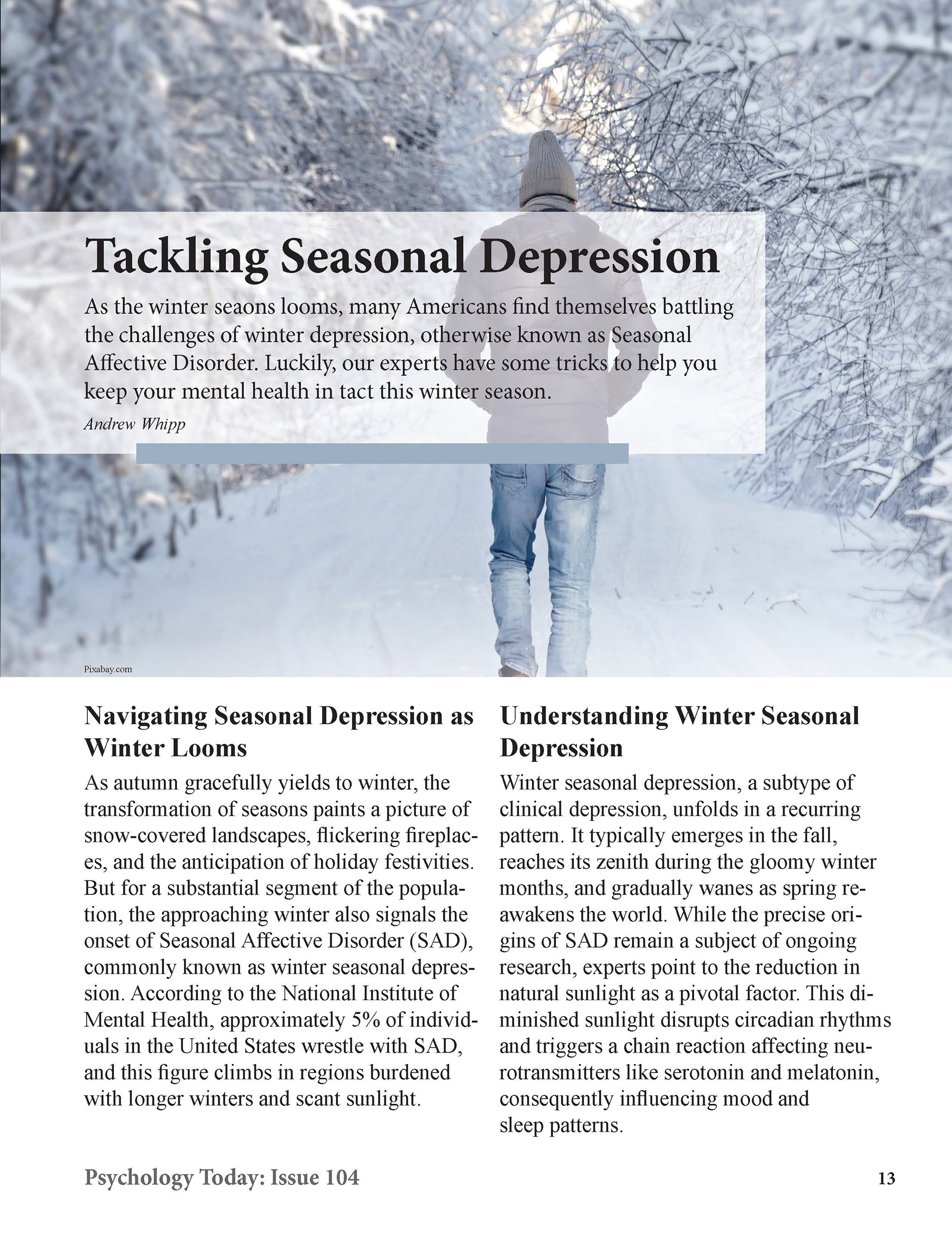
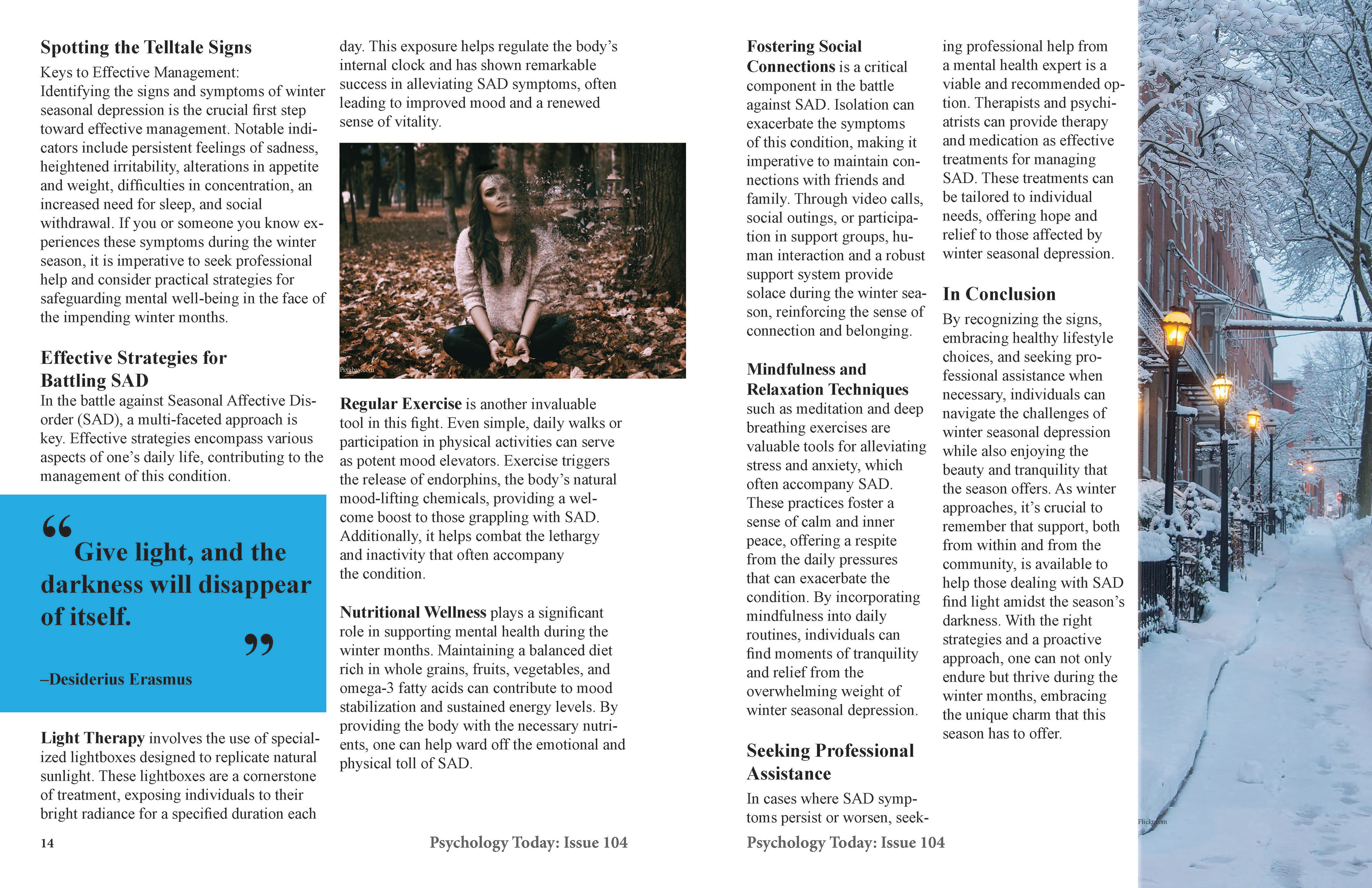
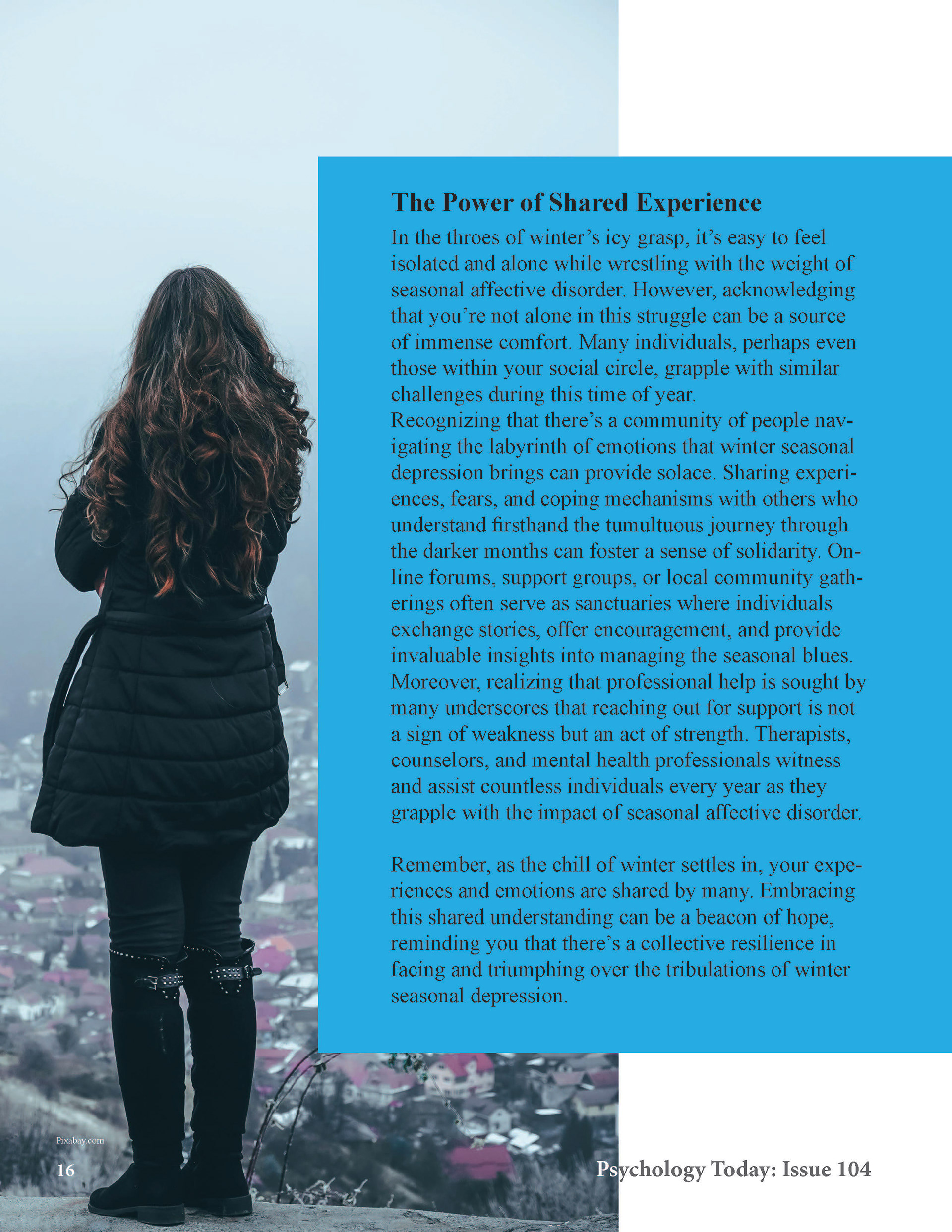
4 Page Magazine Design
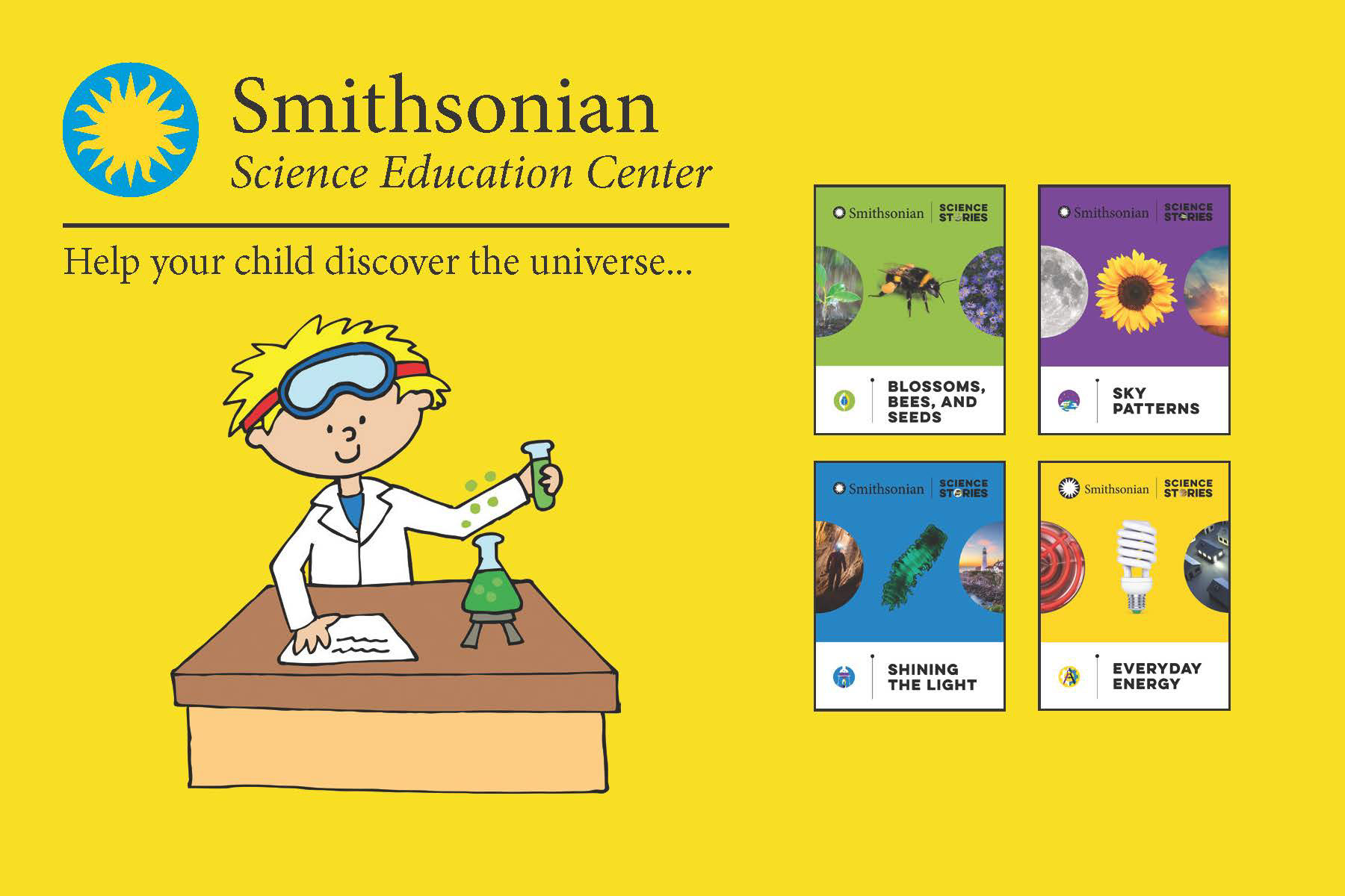
Promotional Postcard

5 Pattern Design


1. The first is a geometric pattern. First I started adding squares on to the page. Then, to make it more interesting, I added vertical and horizontal lines to split them into triangles.
2. The second was a typography pattern, For this one, I thought of home decor and simply wrote "Home" in a font called Coquette.
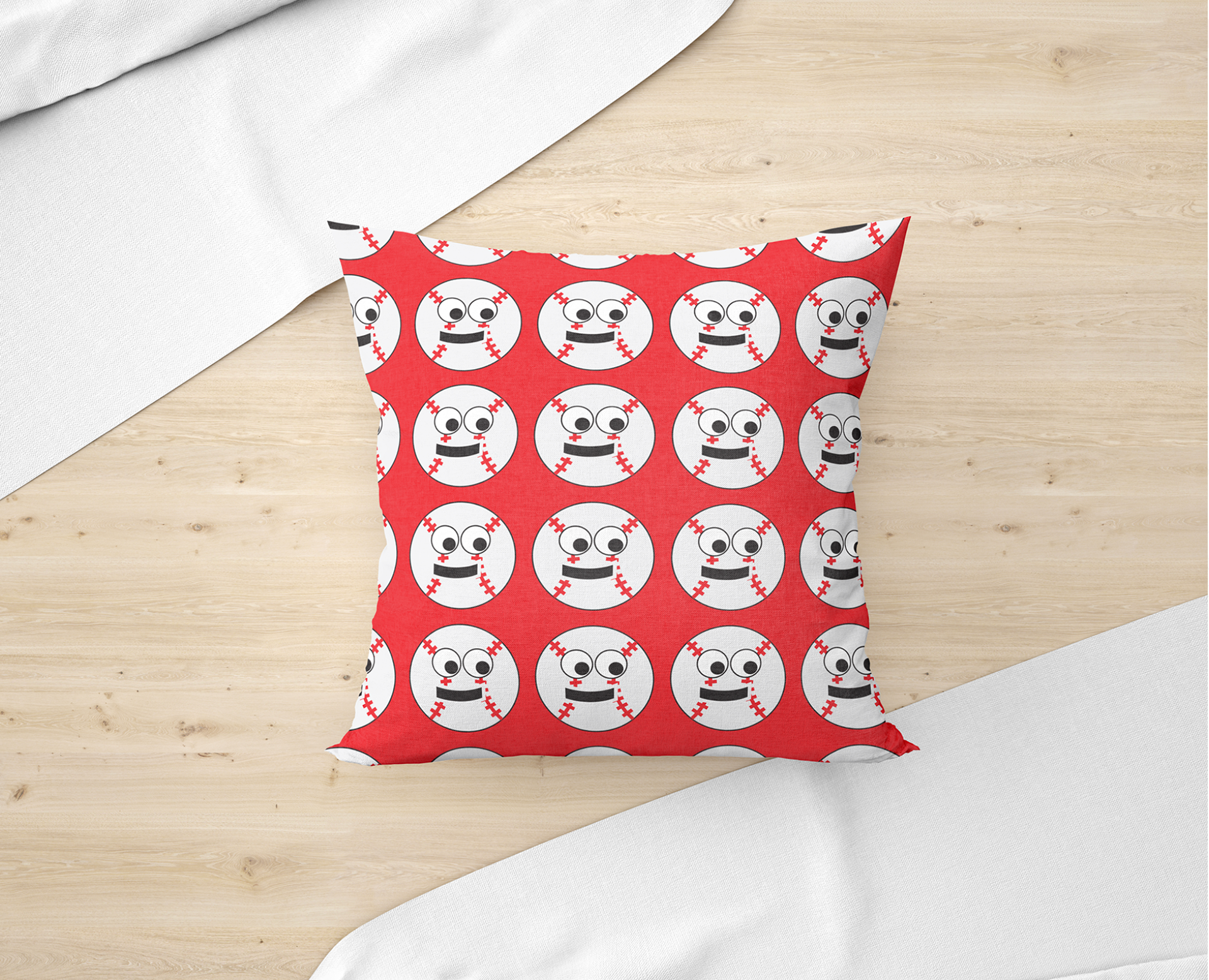
3. The third design was a character design. Inspired by the baseball season that had just started when I designed this, I then added a mouth and eyes to the baseball I designed to bring it to Life.
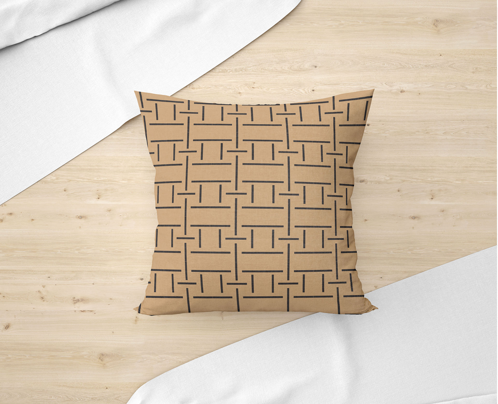
4. The fourth was a minimalist design. For this I was inspired by a metal work desk that used to be in my garage when I was little that had line patterns, so I decided to use lines for this one.
5. The last one was abstract. Abstract for me starts off with curvature and things that may be unexpected. I also used colors that may stick out or be out of the ordinary as well.
Business and Logo Design
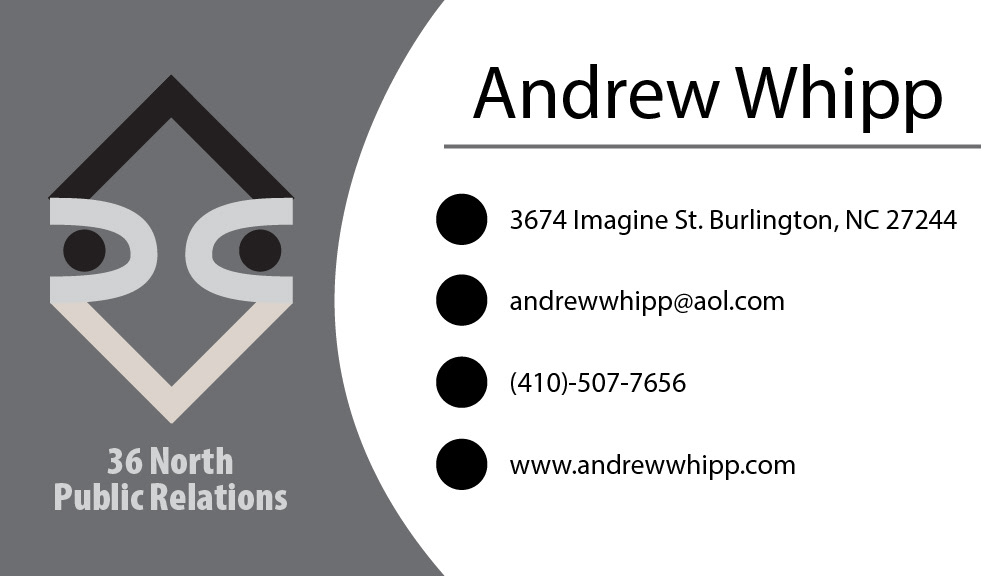


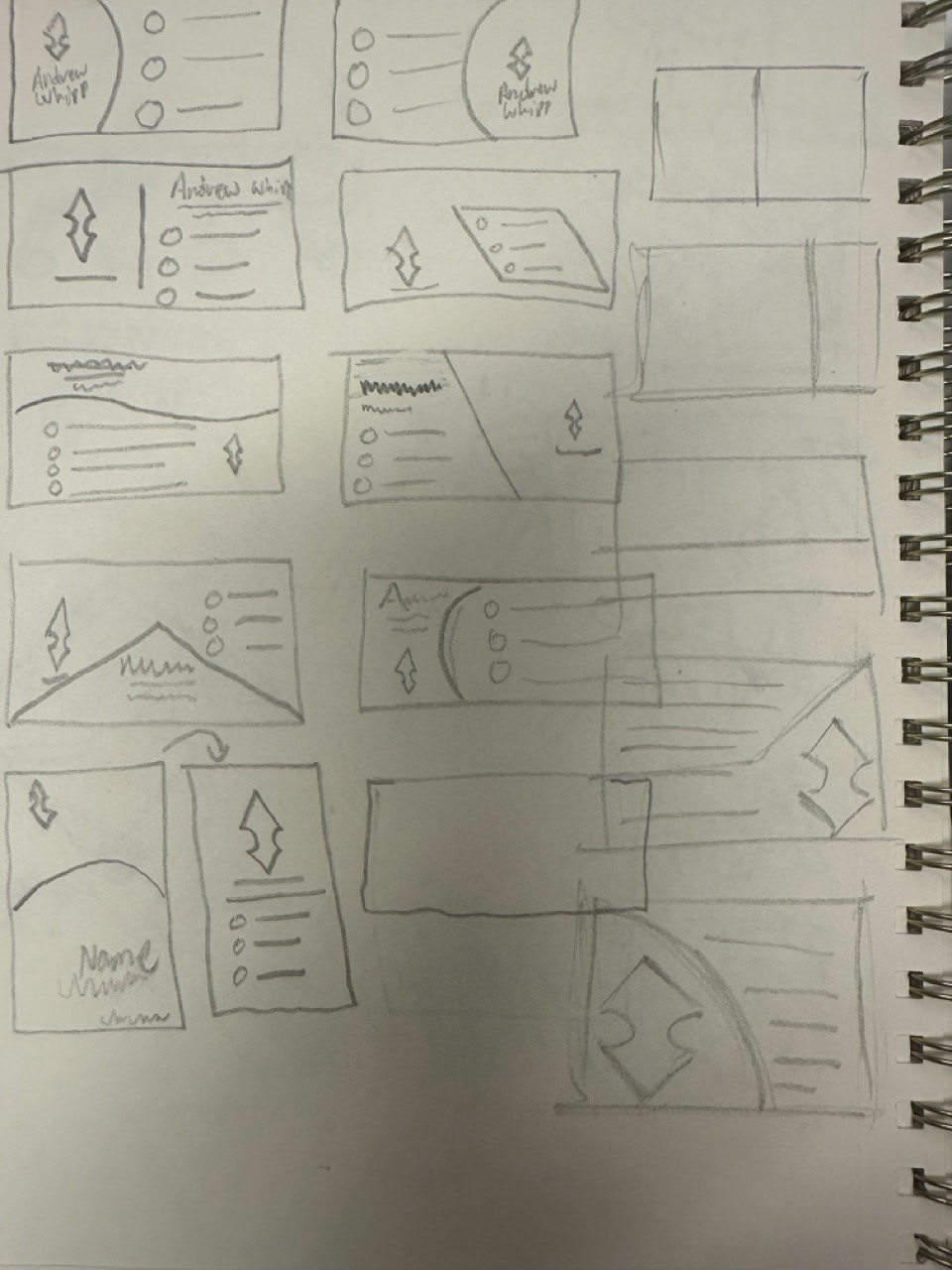
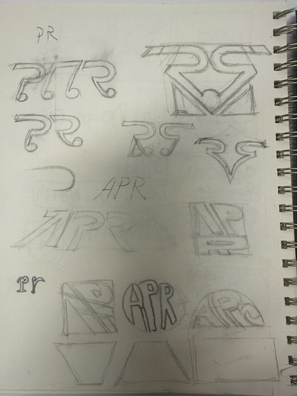
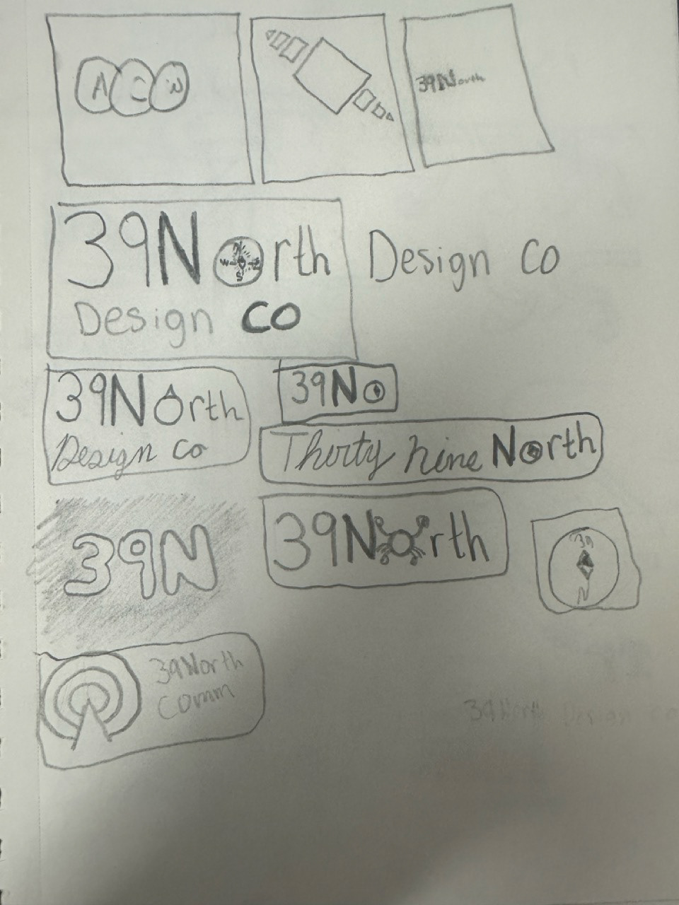
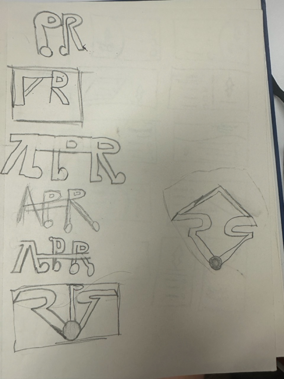
For this project, the first thing I designed was the logo. I knew I wanted the business to be PR related, so ultimately the logo was designed around those two letters. From there
Collages: Elon University/Under the Sea
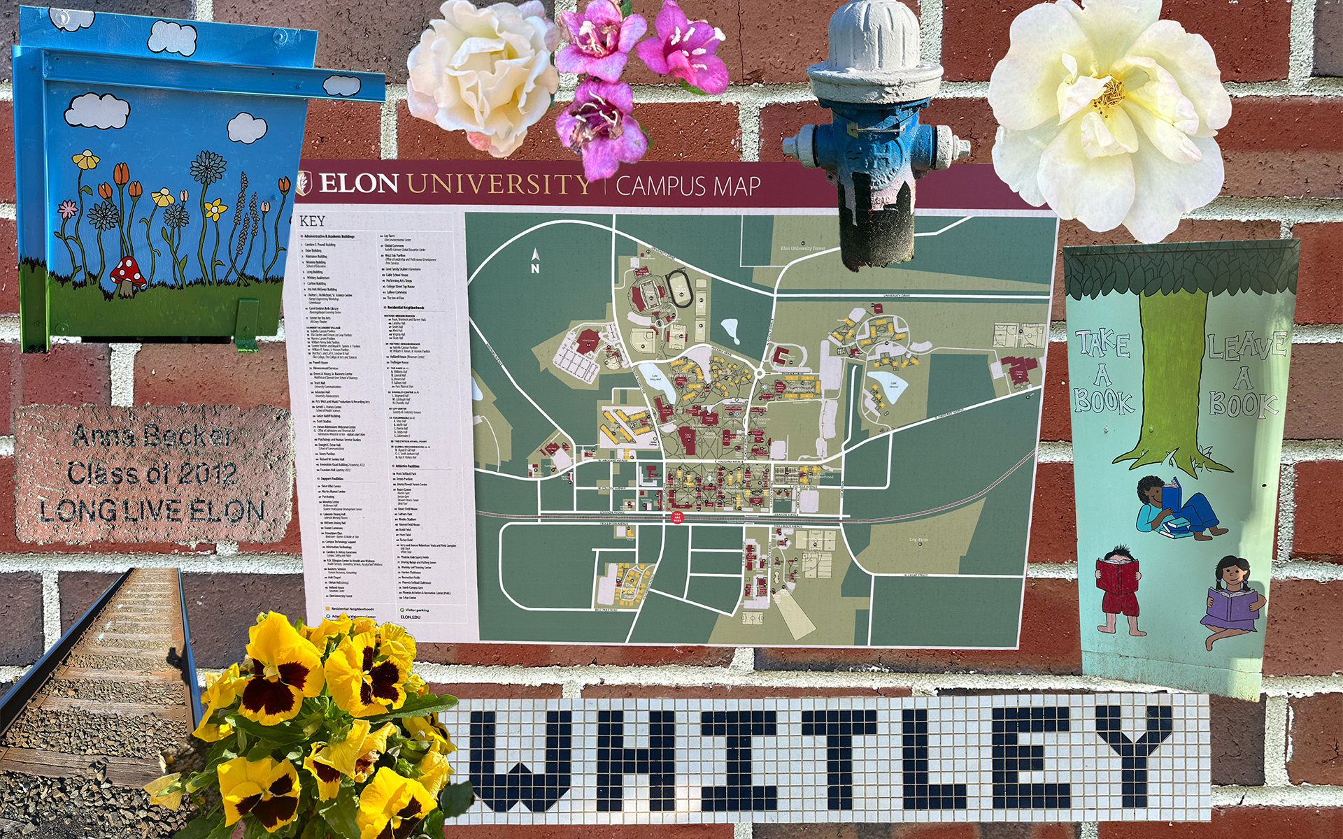
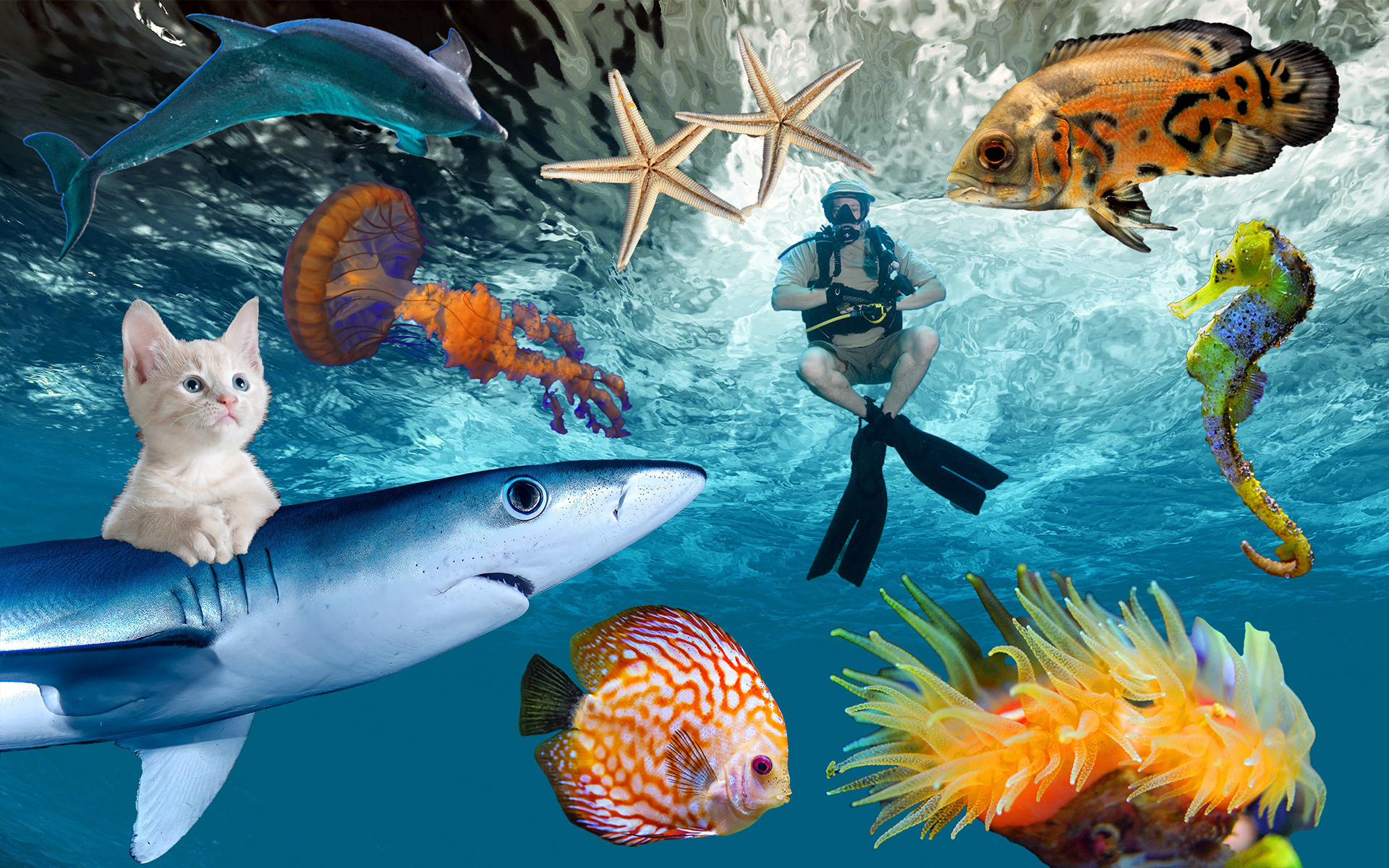
For this project, I used images I took from around campus and made an Elon themed collage as seen on the left. On the right are Creative Commons photos used to make an ocean theme; however, I included one abstract such as the cat on the shark to intrigue the viewer.
